Pages

Sunday, July 05, 2015

Quick sketch dump

I've been trying to make myself get up early and spend a little time working on studies before I go to work. Mostly I've been using Panoramio to find landscape reference. I try to keep most of them to thirty minutes or so, but here are a couple I enjoyed enough to spend an hour or two on.


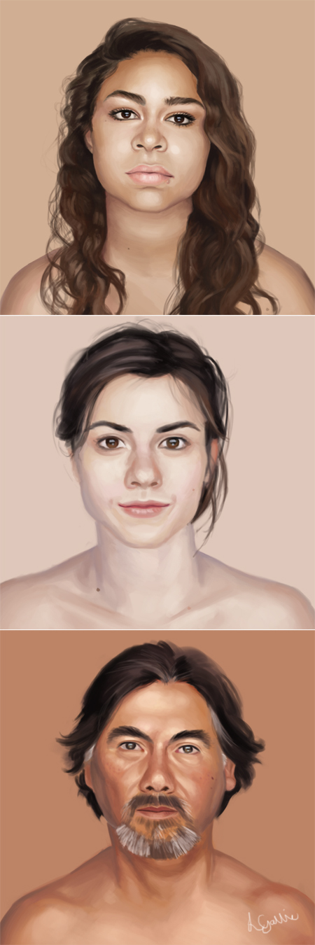
 I also discovered a great Tumblr blog for facial reference - http://humanae.tumblr.com/. Not ideal if you're looking for dynamic angles or lighting, but great for practicing skintons and looking to study different facial features. Like a lot of artists, I catch myself painting the same faces over and over so this is good practice for me.


I also tried to make myself get up a little early to go for a run on alternate mornings. That...has not worked out so well. My motivation to go outside and move my feet is apparently at an all time low first thing in the morning. But it does make getting up to sketch, knowing I can stay in my pajamas, much more appealing!

Tuesday, October 14, 2014

Update on the State of Me

Firstly, an update on Duck Dive, which is progressing nicely from the blocky scribble I started with (after much ado about posing, and a few quick studies trying to capture the motion -  I'll post those another time). I know, I know, the poor mermaid has currently sacrificed her arms. I'll either get them right soon or call it "creature design" and pretend it was on purpose. Shh, don't tell.


Secondly, I'm working on another commission for my wonderful friend Grace Draven (who I illustrated Entreat Me for, as well as Master of Crows) and after a round of thumbnail sketching, here's the final concept that I'm currently working from!
 

I took a much needed holiday last month to visit my friend and talented comic artist/illustrator Becca or Pika-la-Cynique, as followers of my art might know her better by. We ate barbeque and crepes, went hill-walking and took in the views of southern France, enjoyed Feminist Artist Rants in person instead of on Google Hangouts for a change, and also drank until giggly. There might have been dancing.

I also applied for an awesome training course in Glasgow to kick my senior artist skills into touch, so I'll be travelling down once a month to learn more about the digital arts business, company management, public speaking and presenting (which is something I'd like to get a lot better at, for teaching and workshops and so on) and lots of other good stuff. AND I get to go on a trip to San Francisco with the others in the programme in February! It'll be my first time visiting, and we'll be seeing a lot of awesome Silicon Valley companies so I am very, very excited!


Friday, January 31, 2014

Duck Dive

Just a little personal piece I've been sketching on and off a few evenings lately. Still lots to work on with the character lighting. Underwater scenes are so beautiful :)


Sunday, June 23, 2013

Entreat Me - Steps

Remember this?


I got a shiny new computer built not too long after this was completed and I finally pulled the last few folders off my backup HD and onto my current one - including the step-by-steps and notes I'd saved out for the progress post on this cover.  The author, Grace, has been posting lately that shje's on the home stretch towards finishing the manuscript for this book, so I figured it was a good time to return to it.


To start; thumbnails and experimenting with type and layout.  I don't use thumbnails as much as I should but they're definitely a must when working for a client. It also helps when finding a composition that works with the type treatment. Additionally, Grace and I are good friends but we each have different tastes in cover art, so what I might instinctively go for is not necessarily what she would like (for example, she prefers faces to be partially obscured or hidden whereas I am the opposite and have to fight myself not to show them off) .  Luckily she is very descriptive and provides tons of reference for what she wants and I try a lot of different options to try and incorporate her ideas.

The key things to include here are a medieval look, a dark moody feel hinting at the romance, the roses, a shadowy hero and a strong, elegant heroine. Grace was also font of several covers that used frames in the composition.


Grace and I picked out several things she liked from the first round of thumbnails, and I worked up three more detailed sketches.  The favourite was number 2, with a few modifications to the Beast character (as this was a romance, placing the man rather than the Beast on the cover created a wider commercial appeal. But I had a few ideas up my sleeve for hinting that this was still a Beauty and the Beast retelling).


Next up, adding colour, fixing anatomy and a little fashion design. With a fantasy setting, perfect historical accuracy was less important as long as the medieval feeling came across, so the characters' dress was brought together from many different references. Including many repeated oglings of the costume porn in The Tudors TV series. Oh the sacrifices we must make for art...


Louvaen's dress almost received a colour makeover but ultimately I felt the sleeves broke up the bold statement the pure red dress made. Entreat Me was going to be published digitally so I had to consider how the cover needed to attract readers in a thumbnail size on Amazon. Besides that, we had already agreed on a limited colour palette (both for the aforementioned thumbnail considerations and to keep the cover more moody and muted) and sticking to that meant most of my options for the sleeves either blended into the background or were too close to flesh tones, both of which made her arms look detached and odd.

Ballard's features received some sharpening and a lighting change, and his outfit picked up a few additions that hinted at his true nature in the books...


Finally the background was given detail and the rosebushes were added. I always find red a tricky colour to work with and it was a challenge making the roses appear luminous, silky and just a touch too perfect.

A few touches of rich, warm dappled light on a Soft Light/Overlay layer and the type treatment added back in as in the first image posted, and we're done!

Tuesday, April 23, 2013

On Gratitude

I got a really lovely comment the other day. I get a lot of really lovely comments (yes, you can go ahead and call this a humblebrag if you like), but this particular one really touched me.  It came at just the right time - I've had a few tough, hard-working, disappointing and quietly emotionally taxing months, and at this particular moment I either needed some words of encouragement or a kilo of ice cream - and it was worded just right. And I kept coming back to it and it kept making me smile.

"This is so beautiful its breathtaking. I cannot tell you just how much I love this - thank you so much for sharing this amazing picture :)" ~SeaPiper -

That's it.  Just some simple words, but I know that feeling of seeing something so beautiful it takes your breath away a little bit and right now it just blows me away that someone else could feel like that at something I've made.  That they could like it so much they actually thank me for sharing it.  That's kind of amazing.

As artists, we're under pressure to constantly Do Better. Learn more. Grow. Improve (faster). That thing you painted yesterday is now worthless, why haven't you moved on yet? Be your own toughest critic. Change it up (don't let me catch you looking back at your comfort zone in longing!). What do you mean you aren't going to shell out $300 for this Essential Workshop - doesn't your craft mean ANYTHING to you? Don't forget to watch every single one of this artist's educational livestreams, follow all these blogs WHILE memorising Loomis' entire works AND doing at least a hundred gesture sketches, a self-portrait and a still life study every day, and if you don't post all those to the meanest, most hardcore art forum you know and let them tear apart your latest work six ways from Sunday, well then, you're not REALLY committed to improving are you?

Basically, it can be REALLY hard to stop and appreciate a positive comment when someone out there probably thinks an "AWESOME!" is one of the seals that opens the Gateway to Artistic Failure! (Next step - actually liking something you painted a year ago. Oh, the horror!)  But sometimes, we need to be told that someone finds something that we've done awesome, just as it is, imperfect as it is.

Encouragement is not the devil incarnate.  This has made me very aware of how bad I am at realising this, and how ungrateful it is to the people who are trying to encourage me.

So this is me saying thank you to all the people who have told me that my art is beautiful, that it made you smile, or chuckle, that it reminded you of something, that it made you want to draw, who ask about how it was made, who just took a second to hit Favourite/Like/Reblog; for saying that something I did, whether it's five minutes or five years old and when it's far from perfect, had an teeny positive impact on your day.  And thanks especially to ~SeaPiper, for prompting this (and also for some Tumblr discussion from *MelissaFindley and *juliedillon on accepting critique, which factored into my thoughts).

Wednesday, September 12, 2012

WIP Wednesday & a blast from the past!

Dagger finished, started working out the mehndi  (yes, I usually start out with scribbles like this until I stumble onto a shape I like). Like everything else, I'm going for a shell/coral design, all whorls and swirls.  Listening to the How to Train Your Dragon soundtrack while I do it - music distracts my brain so I don't overthink the patterns too hard.


I also stumbled across something while I was tidying out some old folders. My high school sketchbooks used to take a real beating, being carried about to ever single lesson (for that precious 3 mins drawing time before the teacher arrived), to and from my friends' houses, on holiday, and pretty much everywhere else I went.  When we got a scanner I started "saving" some of the drawings I liked best by scanning them before the sketchbook fell to pieces entirely. I remember doing this while I was still in high school - about fourteen or fifteen, I think.  So that makes this at least ten years old!


Anyone guess what book they're reading? :)

Wednesday, September 05, 2012

WIP Wednesday (Bouguereau Study)


Study of Faneuse (The Haymaker) by Bouguereau.  Started while I was playing around with a friend's iMac (if I ever win the lottery...), never got around to finishing it.  It's not my favourite Bouguereau, so I'm in two minds over whether I should just suck it up and finish it or move onto a master study of a painting I really like.  At the Edge of the Brook, for example.